BasicPlotter
Collection of plotting functions, some quite general, others rather specific. For many examples here we’ll use the penguin dataframe provided by seaborn, because it comes conveniently with the package and because penguins are great.
*BasicPlotter.base_code*
  species     island  bill_length_mm  bill_depth_mm  flipper_length_mm  \
0  Adelie  Torgersen            39.1           18.7              181.0
1  Adelie  Torgersen            39.5           17.4              186.0
2  Adelie  Torgersen            40.3           18.0              195.0
3  Adelie  Torgersen             NaN            NaN                NaN
4  Adelie  Torgersen            36.7           19.3              193.0

   body_mass_g     sex
0       3750.0    Male
1       3800.0  Female
2       3250.0  Female
3          NaN     NaN
4       3450.0  Female
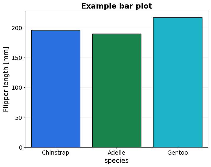
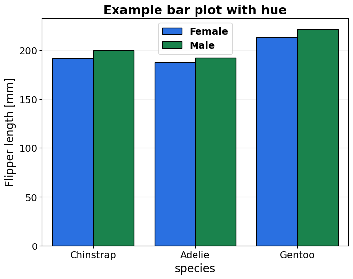
- BasicPlotter.basic_bars(plot_df, x_col, y_col, x_order=None, hue_col=None, hue_order=None, title=None, output_path='', y_label='', x_size=8, y_size=6, rotation=None, palette=None, legend=True, font_s=14, legend_out=False, ylim=None, formats=['pdf'])
Plots a basic barplot, allows to select hue levels.
- Parameters:
y_col – Can be list, then the df will be transformed long format and var_name set to hue_col.
y_label – to have an appropriate y-axis label.
*BasicPlotter.basic_bars*
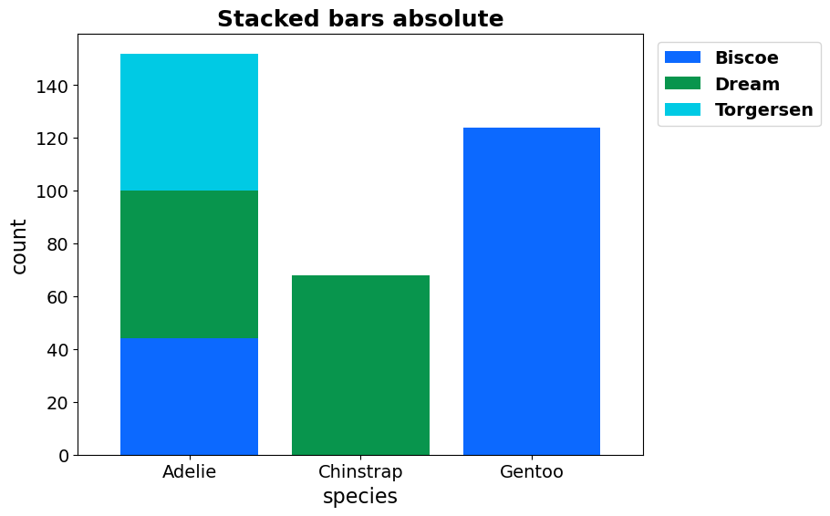
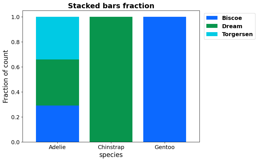
- BasicPlotter.stacked_bars(plot_df, x_col, y_cols, y_label='', title=None, output_path='', x_size=8, y_size=6, rotation=None, palette=None, legend=True, fraction=False, numerate=False, sort_stacks=True, legend_out=False, width=0.8, vertical=False, hatches=None, font_s=14, formats=['pdf'])
Plots a stacked barplot, with a stack for each y_col.
- Parameters:
x_col – Column name to use for splitting on the x-axis, if not an existant column will take the index.
y_cols – List of the columns to use for the stacks.
fraction – If True take all values as fraction of the row sum.
numerate – Whether to add the total number per x-group to the x-label.
sort_stacks – Whether to sort the stack groups by size.
legend_out – False to let seaborn place the legend, otherwise a float by how much it should be shifted in x-direction.
vertical – Whether to swap the layout of the plot from horizontal to vertical.
hatches – If given assumes the colour list is meant for the x-axis.
*BasicPlotter.stacked_bars*
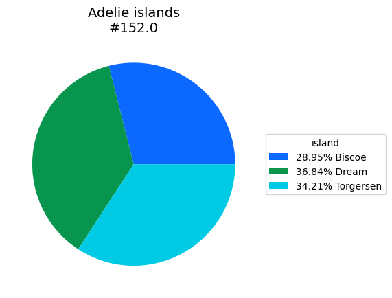
- BasicPlotter.basic_pie(plot_df, title='', palette=None, numerate=True, legend_perc=True, output_path='', legend_title='', formats=['pdf'])
A pie chart.
- Parameters:
plot_df – Either a DataFrame with each category as index or a dictionary with {category: count}.
numerate – Whether to add the summed count across categories to the title.
legend_perc – Whether the legend should write the percentages or absolute numbers.
*BasicPlotter.basic_pie*
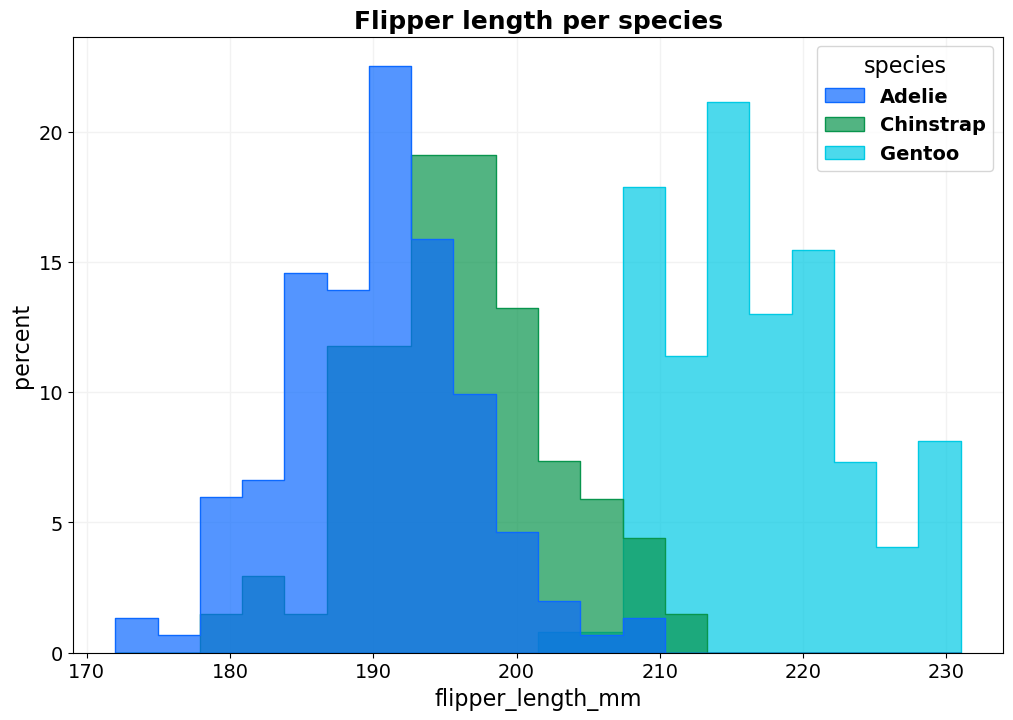
- BasicPlotter.basic_hist(plot_df, x_col, hue_col=None, hue_order=None, bin_num=None, title=None, output_path='', stat='count', cumulative=False, palette='tab10', binrange=None, xsize=12, ysize=8, colour='#2d63ad', font_s=14, ylabel=None, element='step', alpha=0.3, kde=False, legend_out=False, legend_title=True, fill=True, edgecolour=None, multiple='layer', shrink=1, hlines=[], vlines=[], discrete=False, grid=True, linewidth=None, formats=['pdf'])
Plots a basic layered histogram which allows for hue, whose order can be defined as well. If x_col is not a column in the df, it will be assumed that hue_col names all the columns which are supposed to be plotted.
- Parameters:
stat – count: show the number of observations in each bin. frequency: show the number of observations divided by the bin width. probability or proportion: normalize such that bar heights sum to 1. percent: normalize such that bar heights sum to 100. density: normalize such that the total area of the histogram equals 1.
element – {“bars”, “step”, “poly”}.
multiple – {“layer”, “dodge”, “stack”, “fill”}
cumulative – If a cumulative distribution should be plotted instead of a histogram.
kde – Whether to plot the kernel density estimate.
discrete – If True, each data point gets their own bar with binwidth=1 and bin_num is ignored.
legend_out – False to let seaborn place the legend, otherwise a float by how much it should be shifted in x-direction.
hlines – Plot horizontal dashed grey lines at all positions listed in hlines.
vlines – Same as hlines but vertical.
shrink – Float to shrink the size of the bar-width to.
*BasicPlotter.basic_hist*
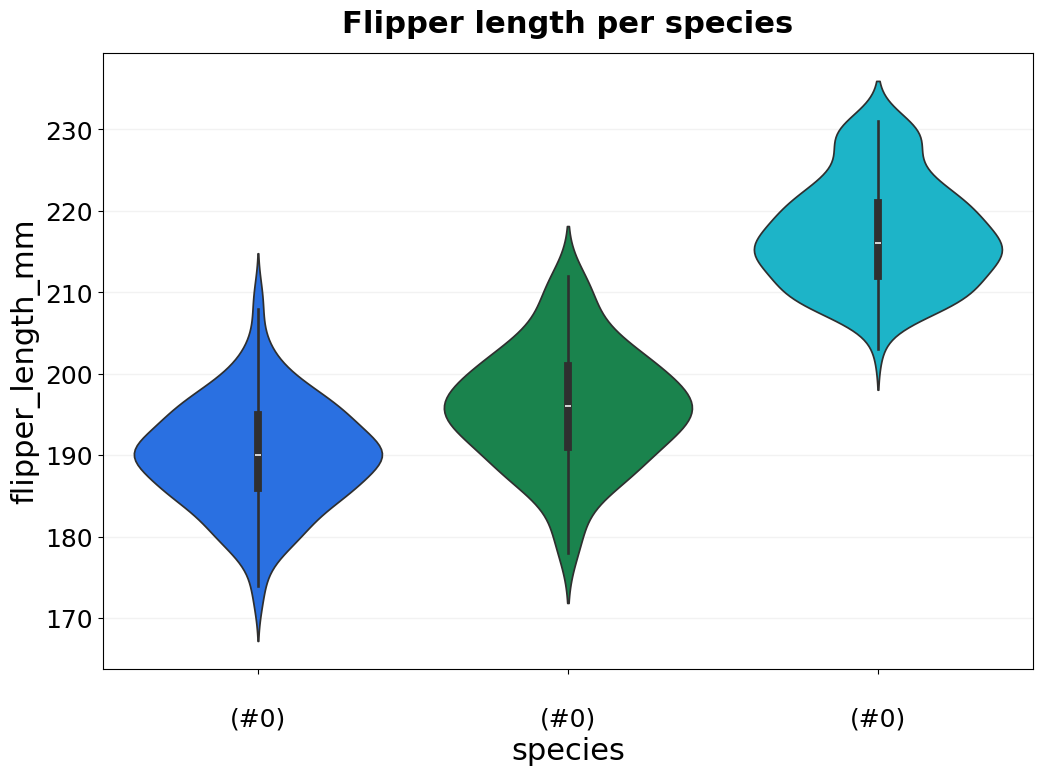
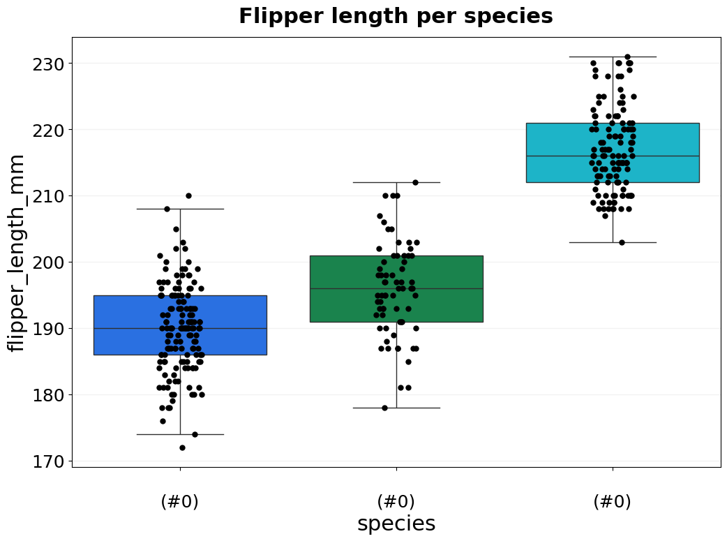
- BasicPlotter.basic_violin(plot_df, y_col, x_col, x_order=None, hue_col=None, hue_order=None, title=None, output_path='', numerate=False, ylim=None, palette=None, xsize=12, ysize=8, boxplot=False, boxplot_meanonly=False, rotation=None, numerate_break=True, jitter=False, colour='#2d63ad', font_s=14, saturation=0.75, jitter_colour='black', jitter_size=5, vertical_grid=False, legend_title=True, legend=True, grid=True, formats=['pdf'])
Plots a basic violin plot which allows for hue, whose order can be defined as well. Optionally plot boxplot, or add jitter points for the individual data points. Use y_col=None and x_col=None for seaborn to interpret the columns as separate plots on the x-asis.
- Parameters:
numerate – Whether to add the total number per x-group to the x-label.
numerate_break – Whether to add a line break before writing the size of the x-group.
jitter – Whether to add jitter points for each data point on top.
jitter_colour – Colour for the jitter points.
jitter_size – Dot size for the jitter points.
saturation – Controls the saturation of the colours.
boxplot – Whether to plot boxplots instead of violinplots.
boxplot_meanonly – Remove all lines from the boxplot and show just the mean as horizontal line.
*BasicPlotter.basic_violin*
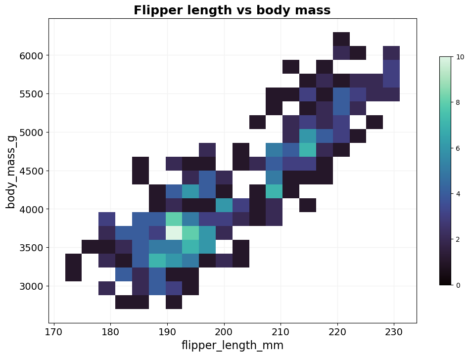
- BasicPlotter.basic_2Dhist(plot_df, columns, hue_col=None, hue_order=None, bin_num=200, title=None, output_path='', xsize=12, ysize=8, palette='tab10', cbar=False, cmap='mako', hlines=[], vlines=[], binrange=None, diagonal=False, grid=True, font_s=14, formats=['pdf'])
Plots a basic 2D histogram as heatmap which allows for hue, whose order can be defined as well. Useful when a scatterplot would be just a big blob of dots.
- Parameters:
columns – List with 2 entries representing the columns from plot_df for the x- and y-axis.
bin_num – Number of bins to use, the higher the finer the resolution. It behaves it a odd though.
cbar – Whether to plot the colorbar that shows the number of counts.
hlines – Plot horizontal dashed grey lines at all positions listed in hlines.
vlines – Same as hlines but vertical.
binrange – Boundaries for the histogram.
diagonal – Whether to add a line on the diagonal.
*BasicPlotter.basic_2Dhist*
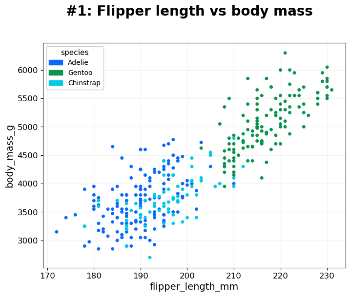
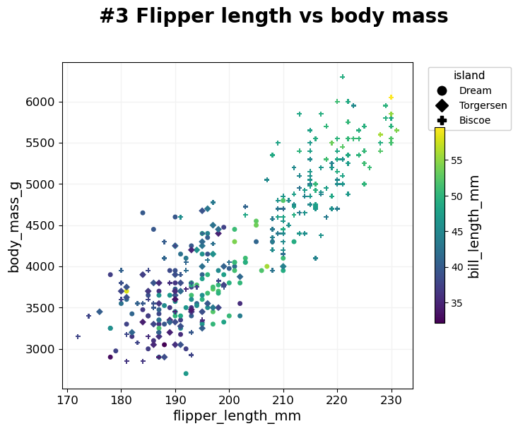
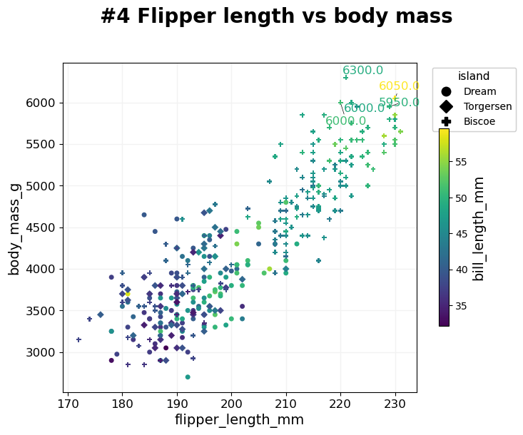
- BasicPlotter.multi_mod_plot(plot_df, score_cols, colour_col=None, marker_col=None, output_path='', diagonal=False, title=None, colour_order=None, marker_order=None, line_plot=False, alpha=0.7, xsize=8, ysize=6, palette=None, xlim=None, ylim=None, msize=30, vlines=[], hlines=[], add_spear=False, na_colour='black', grid=True, label_dots=None, font_s=14, adjust_labels=True, formats=['pdf'])
Scatterplot that compares two scores. For each entry in plot_df plot one dot with [x,y] based on score_col and allows to colour all dots based on colour_col, and if marker_col is selected assigns each class a different marker.
- Parameters:
score_cols – List of two column names to use for the x- and y-axis.
line_plot – 2D list of dots which will be connected to a lineplot.
hlines – Plot horizontal dashed grey lines at all positions listed in hlines.
vlines – Same as hlines but vertical.
diagonal – Whether to add a line on the diagonal.
add_spear – CARE not properly tested. Whether to add the spearman correlation coefficient between the score_cols to the title.
na_colour – How to colour dots where the colour_col is NA.
label_dots – A pair of columns [do_label, label_col] with boolean do_label telling which entries should get a text label within the plot, and label_col giving the string of the label.
adjust_labels – Whether to use the adjustText package to try to avoid overlap of text labels.
*BasicPlotter.multi_mod_plot*
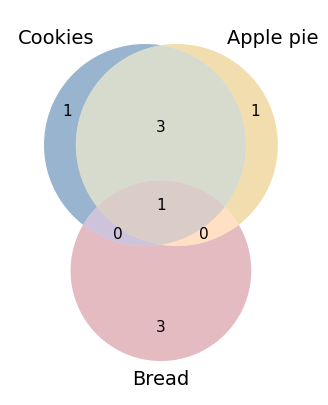
- BasicPlotter.basic_venn(input_sets, plot_path, blob_colours=ColoursAndShapes.tol_highcontrast, title='', scaled=True, linestyle='', number_size=11, xsize=5, ysize=5, formats=['pdf'])
Based on a dictionary of {key: set} with either two or three entries do the intersection of sets and create a Venn diagram from it.
- Parameters:
input_sets – {key: set} for all bubbles that should be plotted.
scaled – If the bubble sizes should be scaled to the set sizes. Choose False if the size difference is too high.
linestyle – Linestyle for the rim of the bubbles.
*BasicPlotter.basic_venn*
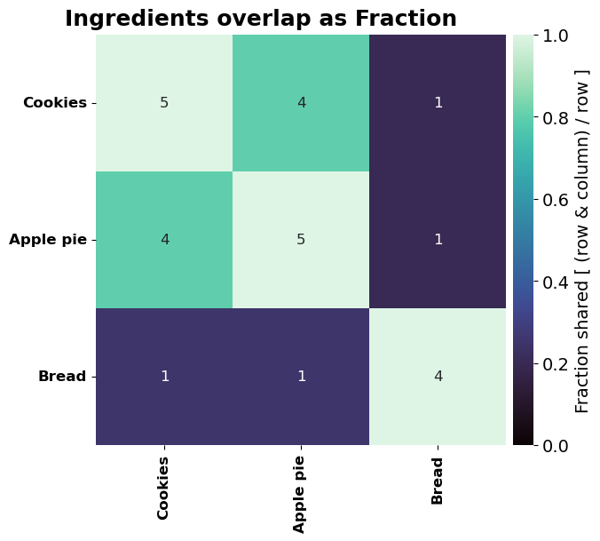
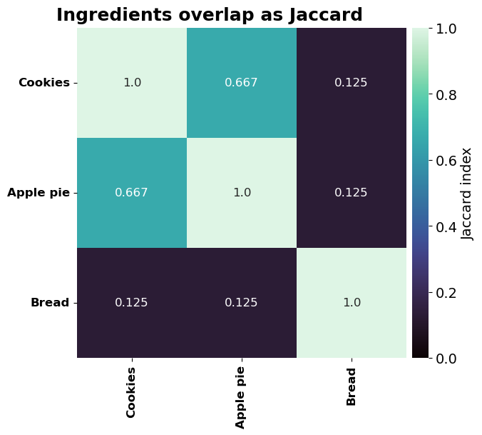
- BasicPlotter.overlap_heatmap(inter_sets, title='', plot_path='', xsize=12, ysize=8, annot=True, mode='Jaccard', annot_type='Jaccard', font_s=14, matrix_only=False, cmap='mako', formats=['pdf'])
Create heatmap of pairwise overlap of a collection of sets. Either make a symmetric heatmap of the Jaccard index or plot the asymmetric fraction of overlap. Combinations are formed by the keys of the dictionary.
- Parameters:
mode – ‘Jaccard’ to show the Jaccard index of the intersection, ‘Fraction’ to show the percentage.
annot_type – ‘Jaccard’ to get the Jaccard index written into the cells, ‘Fraction’ for the fraction, and ‘Absolute’ to get the absolute number of shared items.
matrix_only – Whether only the matrix should be given without creating a plot, will return two dfs, one with the shared metric and the other the cell labels. If False, only producing the plot without returning matrices.
*BasicPlotter.overlap_heatmap*
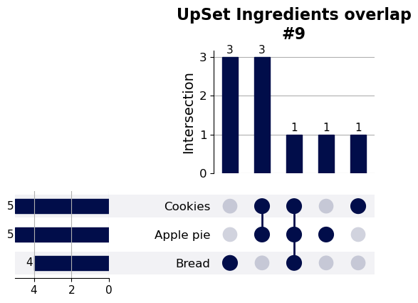
- BasicPlotter.upset_plotter(inter_sets, y_label='Intersection', max_groups=None, min_degree=0, show_percent=False, sort_categories_by='cardinality', sort_by='cardinality', intersection_plot_elements=None, element_size=None, title_tag='', plot_path='', font_s=14, formats=['pdf'])
Based on a dictionary with sets as values creates the intersection and an upsetplot. Uses the upsetplot package (https://upsetplot.readthedocs.io/en/stable/#) based on doi.org/10.1109/TVCG.2014.2346248. The size of the resulting plot isn’t that easy to control with the flags, the package isn’t very user-friendly in that regard.
- Parameters:
inter_sets – Dictionary of {key: set}, each key will be plotted as one row.
y_label – Label for the y-axis.
max_groups – Defines the maximum number of intersections plotted, sorted descending by size.
min_degree – Minimum overlap between groups to show.
show_percent – Write the percentage of overlap on top of the bars.
sort_categories_by – How to sort the rows, ‘cardinality’, ‘degree’ or ‘input’.
sort_by – How to order the columns, meaning the groups of intersections, ‘cardinality’ or ‘degree’.
intersection_plot_elements – Roughly the height of the plot.
element_size – Roughly the overall size and margins.
*BasicPlotter.upset_plotter*
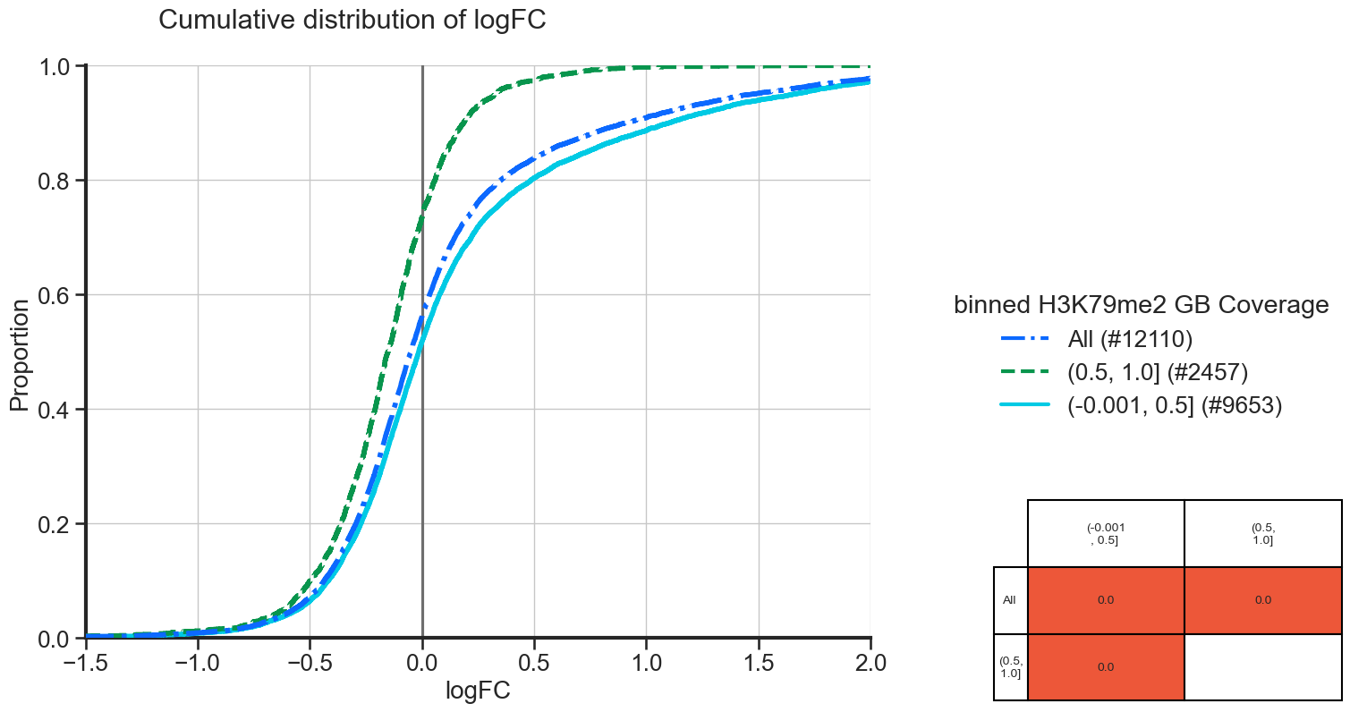
- BasicPlotter.cumulative_plot(plot_df, x_col, hue_col, hue_order=None, output_path='', numerate=False, title=None, xlimit=None, vertical_line=False, add_all=False, table_width=0.3, table_x_pos=1.2, palette=None, font_s=16, grid=True, formats=['pdf'])
Plot the cumulative distribution of all sets of grouping names in the plotting df. Adds a table with a Kolmogorov-Smirnov test for each non-redunant pairwise comparison next to the plot. Cells with a p-value ≤ 0.05 will be coloured in red.
- Parameters:
plot_df – Pandas DataFrame holding the data.
x_col – Column name in plot_df which should be plotted on the x-axis.
hue_col – Column name in the DataFrame used for different curves.
hue_order – If the groups in hue_col should have a specific order.
numerate – If True, show the number of elements in each hue_col group in parentheses.
vertical_line – To plot a vertical line at the given position, e.g. 0.
add_all – If True, add the whole stack of values in x_col again as separate distribution labelled ‘All’.
table_width – Width of the KS table.
table_x_pos – X-position of the KS table, to avoid it overlapping the plot.
*BasicPlotter.cumulative_plot*
From the plot we can see, that the genes with more coverage of their gene body are more often downregulated and that they have less strong positive logFC, compared to genes with lower gene body coverage.