Classification Performance Curves
Functions to create Precision-Recall and receiver operator characteristic curves and getting the respective area under the curve.
- ClassificationPerformanceCurves.classification_plotter(df, sig_col, score_cols, add_random=False, steps=10000, mode='pr', output_path='', colours='glasbey', no_plot=False, recall_start=0, zorder=None, title_tag='', legend_s=18, legend_out=False, x_size=8, y_size=8, font_s=14, line_styles=None, colour_by_threshold=False, threshold_cmap='viridis', formats=['pdf'])
Plots a Precision-Recall curve or a receiver operator characteristic curve based on a DataFrame and calculates the area under the curve.
- Parameters:
df – Pandas DataFrame with each row being an entry that should be classified.
sig_col – Name of the column that identifies the true entries.
score_cols – List of column names in the DataFrame for which the curves should be plotted, all in the same plot. It is assumed that a high score means a higher predicted likelihood to be true.
add_random – If a curve should be added that randomly orders the entries. For specifying the colour of ‘Random’, add a colour to the colour list, otherwise it will be grey.
steps – Number of steps into which the range between the lowest and highest score will be separated, and for each the performance calculated.
mode – ‘pr’ to get a Precision-Recall curve, otherwise a ROC curve.
no_plot – To only get the list of performance values.
recall_start – In case it is known that a certain range of the recall is not covered, limit the whole calculation and plotting to [recall_start, 1].
zorder – List of integers defining the zorder of the score_cols.
colour_by_threshold – If True, do the plot as scatter, and colour each dot by the threshold it was taken from. Uses the range from all score_cols.
threshold_cmap – The colourmap which should be used for the scatter when colour_by_threshold is True.
- Returns:
auc_output: List of the score_cols and the respective AUPRC.
performance_dict: Dictionary with {score_col: [Recall, Precision, threshold] for mode ‘pr’, otherwise [FPR, TPR, threshold] for all tested thresholds}.
- Return type:
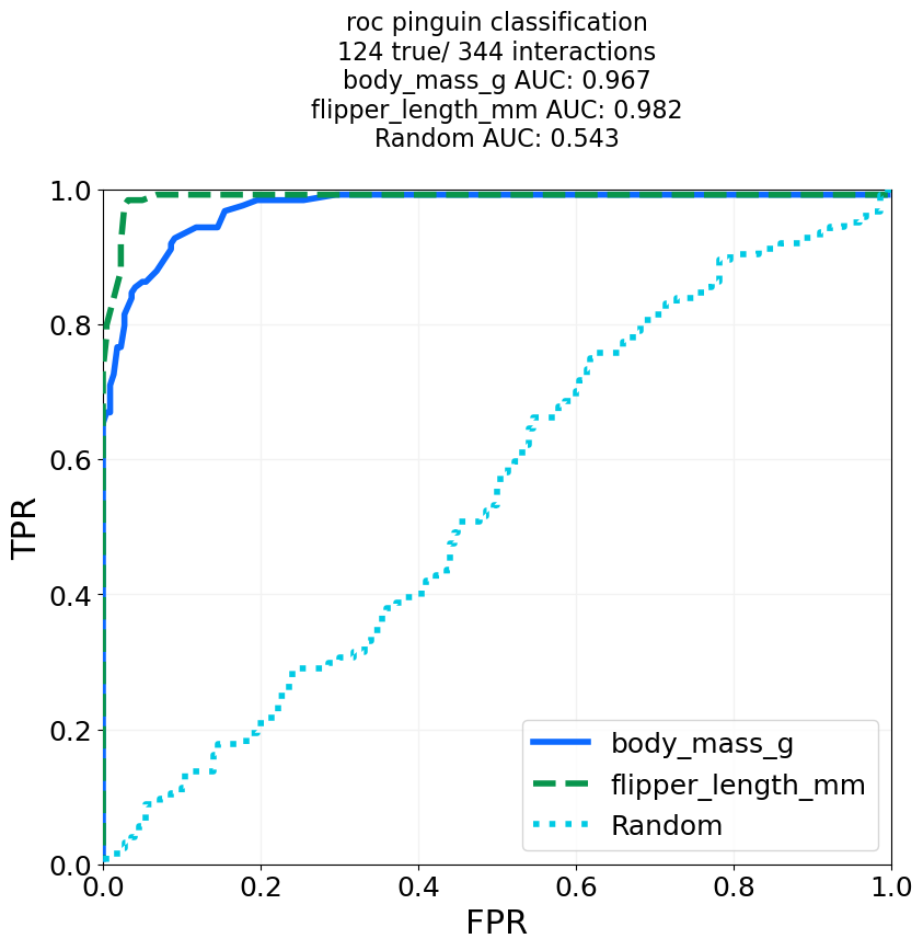
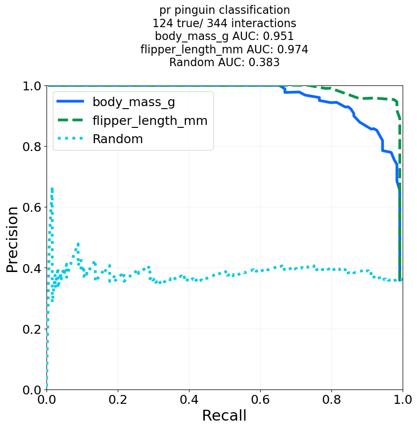
# For the example, we load the penguin data and try the classification of pinguins into Gentoo and non-Gentoo
# based on their body mass or flipper length.
import ClassificationPerformanceCurves
import seaborn as sns
out_dir = 'docs/gallery/'
penguin_df = sns.load_dataset('penguins') # Example data from seaborn.
penguin_df['is Gentoo'] = penguin_df['species'] == 'Gentoo' # We need a boolean to tell true from false entries.
# We try a ROC curve and a Precision-Recall curve, and add curve for random guessing.
for mode in ['roc', 'pr']:
auc_output, performance_dict = ClassificationPerformanceCurves.classification_plotter(df=penguin_df, sig_col='is Gentoo', score_cols=['body_mass_g', 'flipper_length_mm'],
steps=1000, mode=mode, title_tag=mode+' pinguin classification', output_path=out_dir+"GentooClassification", add_random=True,
colours='glasbey_cool', formats=['png'])
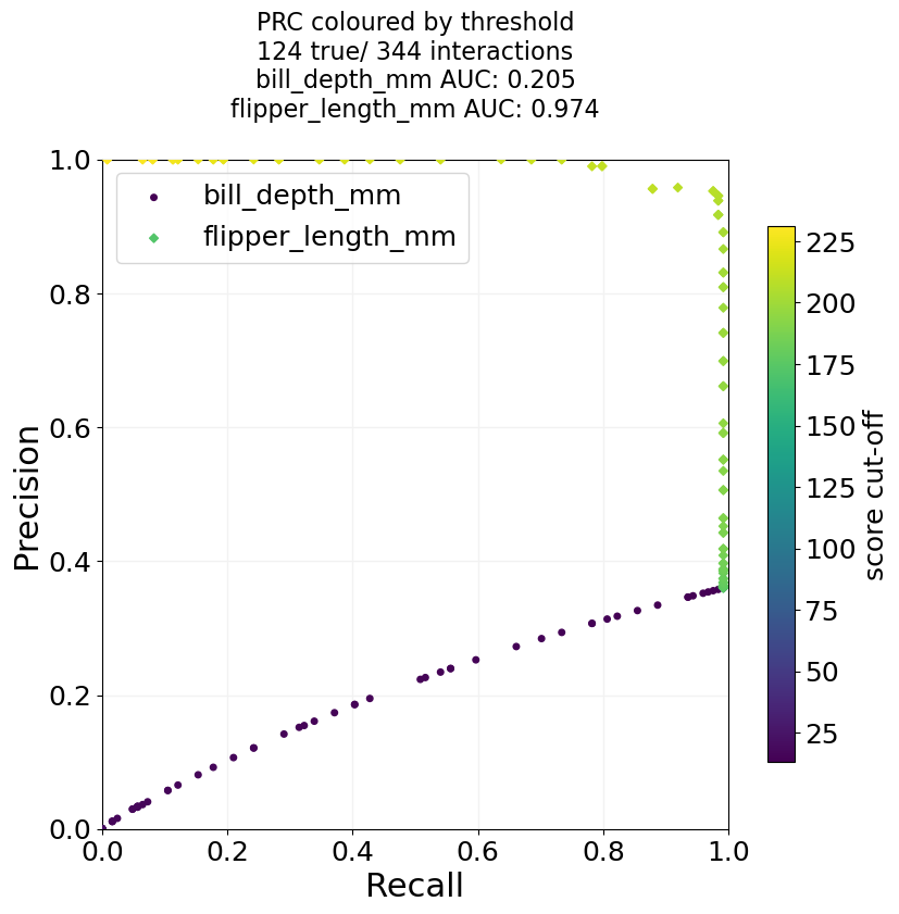
# And we can do a version where we do a scatter plot instead, and colour the dots by the used threshold.
# In that case, it only makes sense to use columns that have the same metric.
auc_output, performance_dict = ClassificationPerformanceCurves.classification_plotter(df=penguin_df, sig_col='is Gentoo', score_cols=['bill_depth_mm', 'flipper_length_mm'],
steps=100, mode='pr', title_tag='PRC coloured by threshold', output_path=out_dir+"GentooClassification",
colour_by_threshold=True, formats=['png'])
# As a side-note, the classification based on the bill depth works so bad for Gintoo, because their average bill depth
# is smaller than that of the other species, and for the function we assume high score means high likelihood to be true.